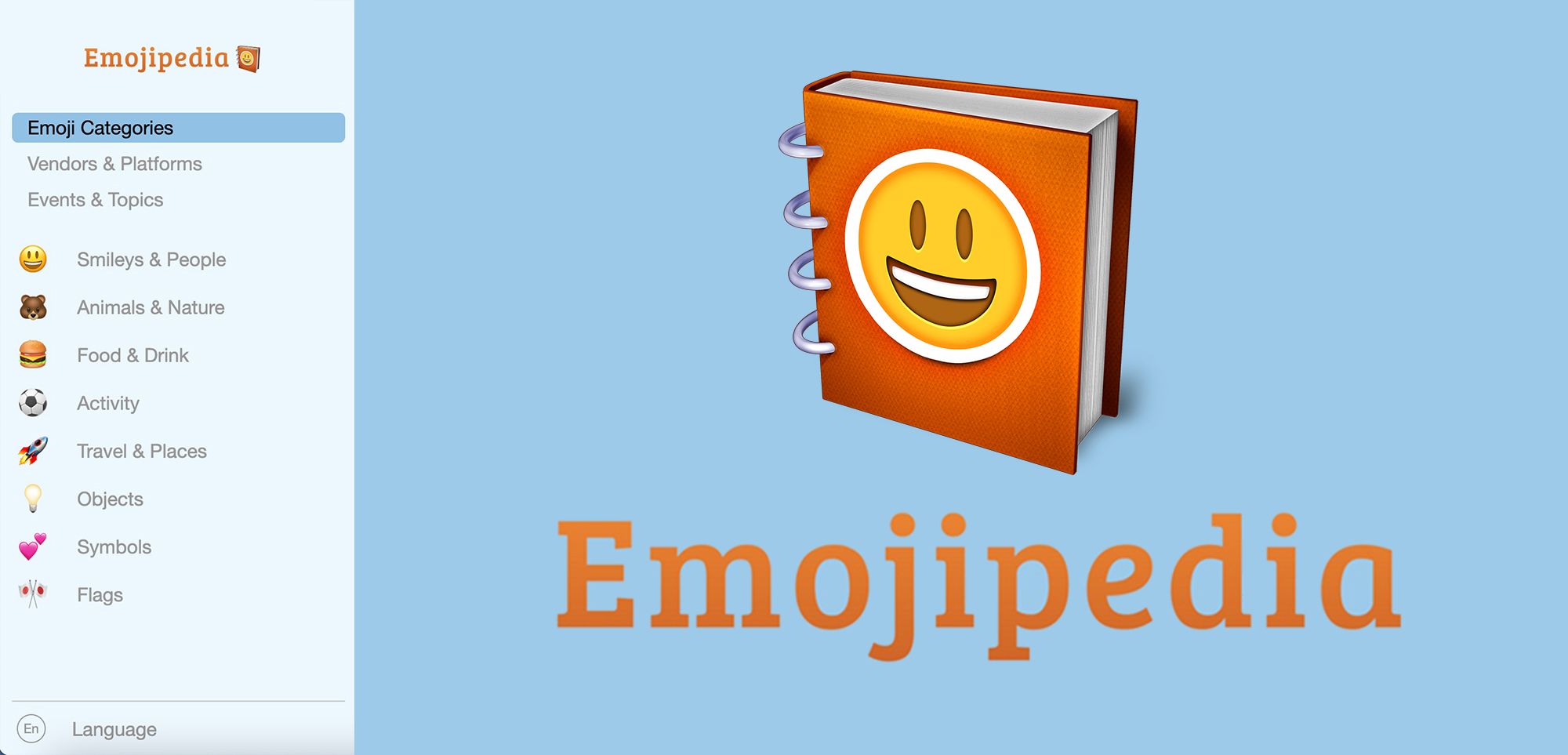
Today Emojipedia has received its first new major site redesign since early September 2015, with the introduction of new fixed navigation and search features for both desktop and mobile users.

📋🧭 Improved Navigation
For desktop users, the most evident new feature is the new fixed menu bar now residing on the left-hand side of their screen, which extends when you hover your cursor over it. The menu also scrolls with you while exploring all of our emoji information.

This menu defaults to displaying the various emoji categories used across the site (such as 😃 Smileys & People, 🐻 Animals & Nature, and 💕 Symbols), as per our previously long-standing top menu bar.

However, this new menu can be changed to list each of our emoji vendors (Apple, Noto Color Emoji, Samsung, etc), as well as different emoji-relevant events and topics (e.g. 🦃 Thanksgiving, 🏳️🌈 LGBT Pride, and 🎂 Birthdays).
The new menu also now contains the language change tool. Placed at the very bottom of the menu, this allows for users to easily change between all of the six languages presently supported for emoji search and navigation, again regardless of what position on a page they happen to be.

You can visit and search through these new versions of Emojipedia via the links below:
- Visit the Spanish Emojipedia
- Visit the French Emojipedia
- Visit the Portuguese Emojipedia
- Visit the German Emojipedia
- Visit the Italian Emojipedia

🔍📲 New Search & Mobile Menus
The cross-site search bar now scrolls with the users as they navigate through our emoji, allowing for swift access to our search functionality across all site pages and positions.

This change is also the case for mobile users, who will see a new fixed top menu with swift cross-site access to both popular page types and emoji search regardless of which portion of a site page you happen to be viewing.


The mobile search functionality also displays a list of the most popular emoji pages across Emojipedia.
The Emojipeida homepage and footer have also been cleaned-up across both desktop and mobile, leveraging new landing pages such as All Emoji Versions and All Vendors & Platforms to detail historic emoji vendors, emoji releases, and other information alongside additional editorial context.

These improvements to navigation and search accessibility are the first steps of many we plan to take over the coming months and years to improve the overall experience of Emojipedia and allow for even swifter access to up-to-date and well-researched information you can trust.